

Designing an impressive website in 2019 will do for your brand what a grand opening of a flagship storefront once did for companies a decade ago. As you build your website, consider the incentives and design tactics listed below to curate the strongest online brand experience possible.
Importance of Website Design in 2019
Target audience perception
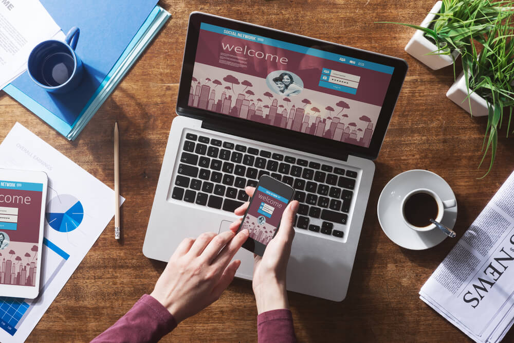
Your website is your most valuable brand real estate in 2019. As consumers continue to shift their lives online, there is a greater likelihood of customers meeting your brand for the first time online and engaging in the consumer experience via your website.
Your website aesthetic, design simplicity and page responsiveness across devices will reflect immensely on your brand. If you want to impress viewers and convert them into consumers, you must meet them at their device of choice with an unparalleled website experience.
Customer conversion
Your website is where prospective consumers turn into your consumers. While other extensions of your brand and marketing strategy are incremental in getting users to this stage, your website is where all your marketing and advertising efforts combine to push prospects through the purchase funnel — whether it be goods or services.
A clean, sleek, and trend-forward website design is essential for walking users through your online shopping experience to check-out, where a transaction is made and where viewers become your brand purchasers, making the first step to becoming loyal consumers.
11 Website Designing Standards to Follow in 2019
Responsive Design
In 2018, websites were assuredly mobile friendly and trend-setters planted the seed for mobile responsiveness. Google even updated its algorithm to make sure its ranking websites were optimal across all user devices.
Responsive design is easy to maintain and comes with so many benefits that there are no excuses to ignore it. A responsive website loads beautifully on any device and functions fluidly, allowing users to interact with content, buttons, and immersive features from the palm of their hand, on the go, or sitting comfortably behind the screen of a desktop. Wherever the user is, your website is there, too, and providing the best possible experience of your brand.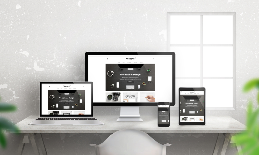
Typography
When it comes to design aesthetic, consumers prefer to see pretty typeface fonts. In 2019, you have the freedom to explore a range of font design elements, including size, vertical spacing, width, and hierarchy.
Traditional font rules have been in place since the rise of CSS. A few of these rules remain, but with more relaxed conditions. For example, headings should be larger than sub-headings, and subheadings larger than body text. What’s different now is that size ratio parameters are open-ended. Indulge in font exploration and find the balance of fine and bold that communicates your brand to consumers without distracting them from your content or product.
Video Headers
By now, the video is a prominent portion of your mixed media, and a significant percentage of your marketing budget is spent on quality video production. Now, the trick with superior video is to get consumers to care about it and want to watch it.
Experiment with visually stunning video headers that encourage engagement without distracting users from pressing play or following the call to action. There is a current design trend to lay light-colored text over darker video stills. Try implementing this tactic, and see where it leads your creative design inspiration.
Parallax
Parallax is a design element that offers different views of your website to consumers as they scroll along a page. While parallax is not quite virtual reality, it increases the depth of your 2D web design to create a more immersive website experience.
As today’s consumer adjusts to augment reality and design, it is advantageous (and eventually necessary) to carry these design elements into other aspects of brand interaction, including your website.
By using parallax in your web design, you have a greater chance of luring viewers in and encouraging them to stay on your page for a while. As viewers tune in to your content and spend more time on your pages, your SEO improves, triggering a positive cycle that promotes more views and engagement.
Hero Images
When using Parallax, try to use Hero Images. Hero Images are large, stunning, and top quality photos that best enable the immersive experience you are trying to provide. Big images also go a long way in making an impactful first impression. Choose your pictures per page wisely, as each one can captivate or repel your audience’s attention.
CSS3 Animation
The animation is the beloved favorite of website scrollers, media consumers, article readers, and third-party passersby. Animated characters are easy to grow fond of, to remember and to listen to when learning a new concept or getting to know a brand.
In 2018, animations began infiltrating website content and design, thanks largely to CSS animation and SVG animated graphics. With tools available for everyone to use, adopting animated graphics, scrolling effects, background video, or micro-interactions is an easy decision to make.
Hamburger Menu
As screens get smaller and websites adapt to fit these interfaces, one feature that is shrinking to match design demands is the menu. Instead of listing menu options horizontally or vertically across a page, three little horizontal lines are now enough to communicate that a particular corner of the page is where the menu lays. Include this sleek, simple design to make the most of your website design in 2019.
Material Design
Material Design in an adaptable Google system that includes guidelines, components, and tools that accommodate user interface design best practices. Material Design and Material Components enable web developers and designers to work in seamless collaboration to produce a website that is most pleasing to and engaging for a viewer.
Experiment with the components of Material Design to offer viewers a varied online experience that reflects your technological and artistic aptitude. Remember that visual design is a mode of communication, and you can tell an entire brand story or idea by simply swapping design materials.
Card Layout
Card Layout is a design element that divides web pages into separate sections. Each section has headings, content, and appeal of its own. A consumer might click into several card sections from one landing page, navigating into a thoroughly enrapturing experience only to return and dive into a completely different and equally immersive journey through another card section.
Include an Icon Library
Use the Icon Library to show viewers icons with each brand extension you have to offer. Icon Library uses vector graphics for icons, so you don’t lose image quality while scaling images to the desired size.
Stay ahead of website trends in 2019
A big part of staying current with web design demands is staying ahead of website design trends. Forecasting trends can be time-consuming and costly, but as your online presence becomes your focal point of real estate, the investment is essential to your business.
Learn more about the trends above and the best ways to incorporate a few into your company’s website and marketing strategy by getting in touch with our team at Rosy Strategies. We have all the expertise and guidance you’ll need to get ahead of next year’s design experience expectations and retain viewers as your loyal brand consumers. Visit our website to learn more, today!


