SOURCE: Forbes
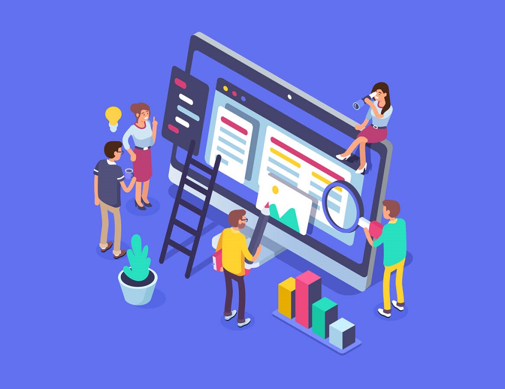
The goal of most business websites goes beyond being informational. People are in business to make money, and revenue generation is the ultimate goal of a business website. Everyone tells you to carve out a niche in your industry, but you still know that numbers matter and you want your design to appeal to the maximum number of visitors.
So, you monitor analytics, looking for traffic spikes and increased reach or engagement with content. But are you potentially excluding many potential customers, fans and followers by not designing for accessibility?
Who does accessible design attempt to include?
When designers talk about accessible or inclusive design, most people know to think about people with permanent visual, auditory or cognitive disabilities, among other impairments. However, the demographic is actually much larger than this. Accessible design also means thinking about how to include people who may be temporarily disabled (e.g., those with a broken limb) or people who have gradual shifts in ability (e.g., the elderly).
To be even more inclusive, consider those who may not have the benefit of a high-speed internet connection or who only access the web via a mobile device. Think about the situations your website visitors may be in and design to accommodate them. Will people be accessing your site while in a stressful situation? Is their environment typically bright and noisy or is it quiet and dimly lit?
Think about the fact that your visitors may come from different cultural, linguistic and socioeconomic backgrounds. They may not be able to identify with or relate to the pictures you’ve chosen. And yet they still have the potential to become great customers.
1. Keep layouts clean and minimal.
Cluttered layouts aren’t just bad design, they can be challenging to understand and interact with. If visitors need to work too hard to figure out what actions you’re asking them to take or they can’t quickly find the answers to their questions, they are likely to hit the back button and immediately exit your site. In the same vein, small elements that are clustered too tightly to one another may prove difficult to interact with for those with dexterity issues.
2. Use color wisely.
When thinking about color on your website, go beyond how you see it. Consider not only those with visual impairments such as color blindness but also those who may be viewing your site in bright sunlight on a mobile phone or an elderly user that may benefit from high contrast elements. Offer alternatives aside from color that differentiate parts of your navigation from others so that visitors of all abilities can find and discover your content.

3. Put alt text, metadata and links to work.
This is yet another example of how designing for all can make search engines such as Google happy. Adding alt text to images was initially used to feed information to screen readers and is now standard best practice to improve SEO. Other clarifying information such as captions and text transcripts for video and audio files help users, while adding keyword-rich content to your site.
Another opportunity to improve the experience for all is to ban the use of the “read more here” text hyperlink. It’s more helpful to users and search engines alike if you use natural language that describes that desired action or what will happen after clicking.
4. Remember, boring and consistent can be good things.
For those of us who work in tech or with websites every day, using the same interfaces and features can get boring so we invent new ways to style a button or interact with content. This may be great for moving the field forward, but the majority of users are looking for buttons to look and act like buttons and for navigation to appear in the “traditional” way.
While cutting-edge web design certainly has its place, it’s arguably not on an everyday business website. Less tech-savvy users count on web design to be somewhat static and consistent in form and function. Visitors won’t give your site a chance if they have to learn a new set of rules on how to interact with your content and will quickly become frustrated if things perform differently than expected. When it comes to button design, navigational layout and other structural elements, boring is good.
Everyone wins when your design is inclusive.
Now that you have a few tips on how to make sure your web design appeals to a broader demographic, the great news is that designing for a wider audience actually forces you to put some standard web design best practices in place. According to usability.gov, studies have shown that accessible websites perform better in search, have reduced maintenance costs and enjoy increased audience reach.
As it turns out, those of us who now interact with the web primarily via smartphone or voice assistants like Siri, Alexa or Google Home benefit as much from accessible design as anyone else. That’s what we call a win-win-win.


